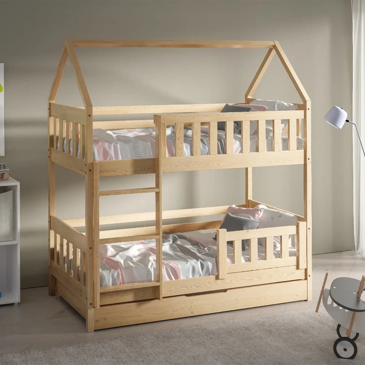
Eka Dětská dřevěná patrová postel ve tvaru domečku CLAUDIE, 160 x 80 cm Přírodní
8 999 Kč
Varianta (3 varianty)
Přidat do oblíbených
| Dostupnost | Expedice do 8 dnů |
| Prodejce | Luceda.cz |
| Výrobce | Eka |
| Doprava | 449 Kč |
Parametry
| Odezva | Okay, I've analyzed the provided HTML and CSS code. Here's a breakdown of what it does and some observations: **CSS Analysis:** The CSS defines styles for several elements, creating a visually appealing and interactive design with a consistent color scheme (primarily using shades of teal/green and light backgrounds). Let's break down the key classes: * `.iris-box`: Styles a container likely used for displaying information or options. It has rounded corners, padding, centered text, a subtle transition effect, and changes background color and border on hover. * `.spec-grid`: Creates a responsive grid layout using CSS Grid. It automatically adjusts the number of columns based on screen size (`repeat(auto-fit, minmax(220px, 1fr))`). * `.spec-box`: Styles individual elements within the `spec-grid`, representing specifications or features. It has a dashed border, rounded corners, padding, centered text, and a transition effect. Hovering changes the border color, background color, adds a shadow, and slightly lifts the element. * `.spec-icon`: Styles an icon (likely circular) with a colored background, white text, and centered content. It's used within `.spec-box` to visually represent each specification. * `.spec-title`: Styles the title of each specification, making it bold and slightly larger. * `.spec-value`: Styles the value or description associated with each specification. * `.montaz-box`: Similar to `.iris-box`, but likely used for content related to assembly/mounting. It also has a dashed border and hover effects. **Key Styling Choices:** * **Color Palette:** The consistent use of `#e4ddd6` (light gray), `#f5fffc` (very light teal), `#00aa92` (teal/green), `#4a4a4a` (dark gray), and `#323232` creates a cohesive look. * **Dashed Borders:** The use of `border: 2px dashed #e4ddd6;` gives elements a softer, more approachable feel than solid borders. * **Transitions:** The `transition: all 0.3s ease;` property on many elements creates smooth visual feedback when hovering, enhancing the user experience. * **Responsive Grid:** The `.spec-grid` class uses CSS Grid to create a responsive layout that adapts well to different screen sizes. **HTML Analysis:** The HTML snippet represents a "Závěrečná poznámka" (Final Note) section. It's styled using inline styles, which is generally less maintainable than external or embedded CSS but can be useful for one-off styling. * The `section` element has a class of `stela-note`, and the inline style sets its maximum width, margins, top border, padding, font family, and text alignment. * Inside the section are two paragraphs (`p`) containing important information: * The first paragraph explains that the bed is delivered disassembled and doesn't include certain accessories (mattress, drawers, protectors, bedding, decorations). * The second paragraph provides a link to contact Luceda for assistance. **Overall Impression:** The code creates a clean, modern design with a focus on user experience. The consistent styling and subtle animations make the page visually appealing and easy to navigate. The final note section is clearly presented and informative. **Recommendations (if you were to refactor):** * **Move CSS to External File:** Inline styles should be avoided when possible. Move the CSS rules into a separate `.css` file or an embedded `<style>` block in the `<head>` of your HTML document for better organization and maintainability. * **Consider CSS Variables (Custom Properties):** Using CSS variables would make it easier to change the color scheme globally. For example, you could define `--primary-color: #00aa92;` and use `color: var(--primary-color);` in your styles. * **Accessibility:** Ensure sufficient contrast between text and background colors for readability (especially important for users with visual impairments). |
Související produkty
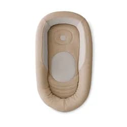
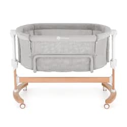
PETITE&MARS Postýlka dětská polohovatelná s funkcí kolébky Glory 2v1 Mocha Beige
3 999 Kč
SklademMalvík.cz
Koupit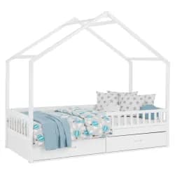
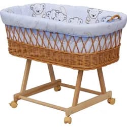
Scarlett Mojžíšův košík s podvozkem pro miminko Toro modrá
4 varianty3 999 Kč
Expedice do 10 dnůMalvík.cz
Koupit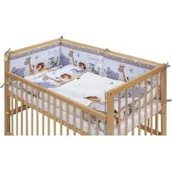
Scarlett Dětská postýlka s kompletní výbavou ZOO 120 x 60 cm béžová
5 290 Kč
Expedice do 10 dnůMalvík.cz
Koupit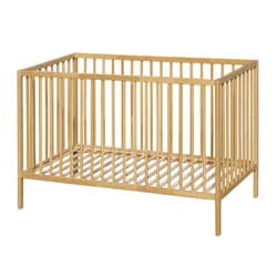
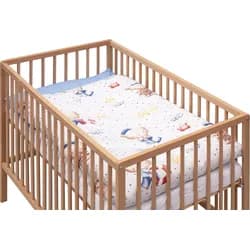
Scarlett Dětská postýlka s kompletní výbavou Doneto 120 x 60 cm
2 varianty3 290 Kč
Expedice do 10 dnůMalvík.cz
Koupit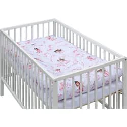
Scarlett Dětská postýlka s kompletní výbavou Scarlett Víla - 120 x 60 cm
3 599 Kč
Expedice do 10 dnůMalvík.cz
Koupit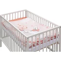
Scarlett Dětská postýlka s kompletní výbavou Scarlett Malia - 120 x 60 cm
3 599 Kč
Expedice do 10 dnůMalvík.cz
Koupit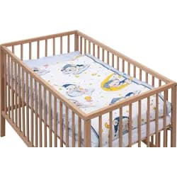
Scarlett Dětská postýlka s kompletní výbavou Lunito 120 x 60 cm
2 varianty3 290 Kč
Expedice do 10 dnůMalvík.cz
Koupit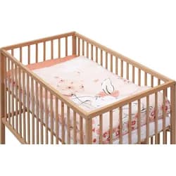
Scarlett Dětská postýlka s kompletní výbavou Malia 120 x 60 cm
3 290 Kč
Expedice do 10 dnůMalvík.cz
Koupit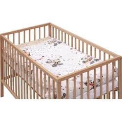
Scarlett Dětská postýlka s kompletní výbavou Gytaro 120 x 60 cm
2 varianty3 290 Kč
Expedice do 10 dnůMalvík.cz
Koupit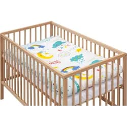
Scarlett Dětská postýlka s kompletní výbavou Papilo 120 x 60 cm
2 varianty3 290 Kč
Expedice do 10 dnůMalvík.cz
Koupit